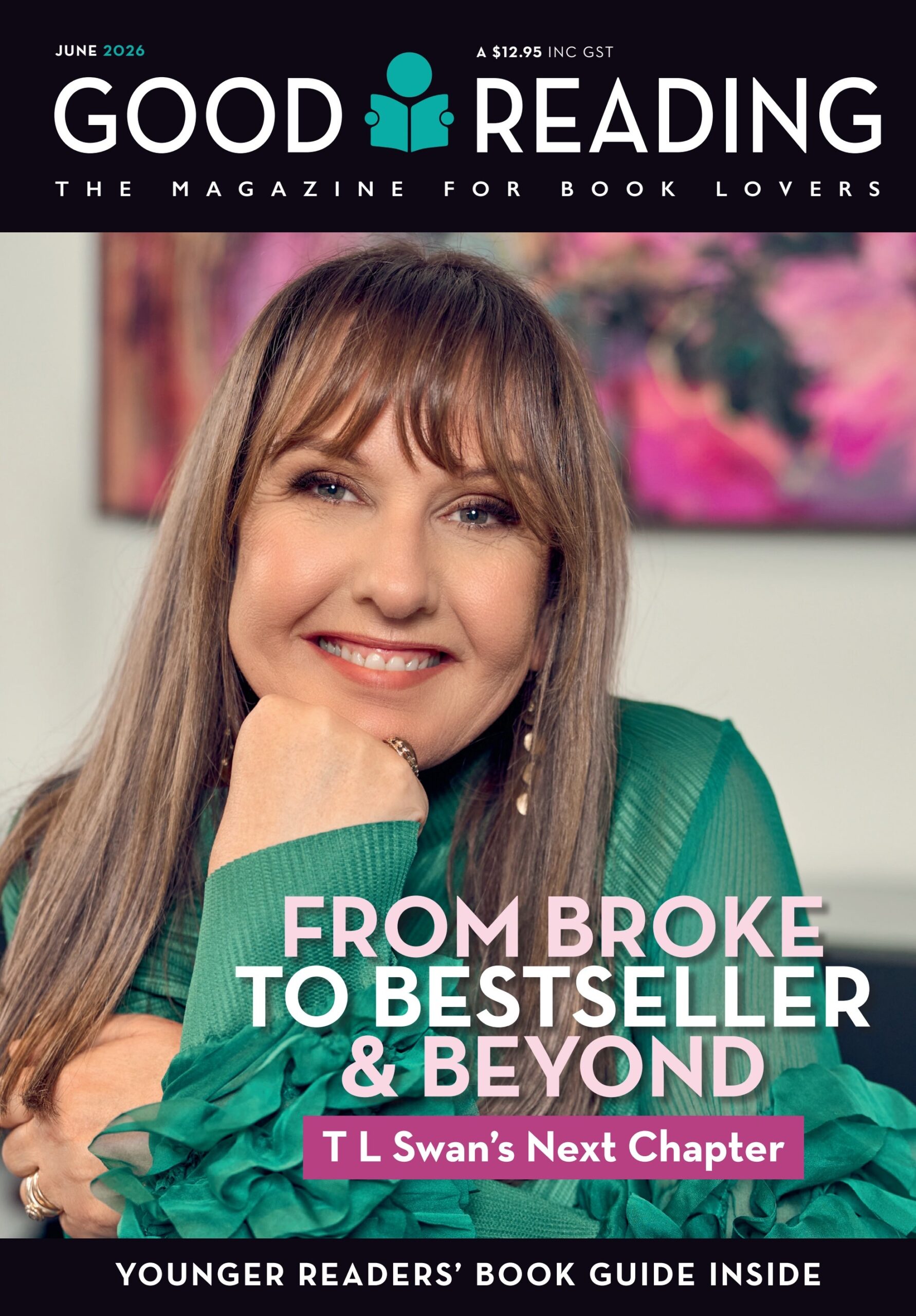


I wonder … when you walk into a bookshop or library what draws you to particular books?
You’re faced with a multitude of covers when browsing books. All different colours and designs. As you stand there running your eyes over all the covers, what draws your eye? I was thinking about this when looking at an array of books on my desk.
Crime thriller fiction books all tend to look similar. You know what genre the book is before you even pick it up. But many of these covers are of a similar feel. What in particular grabs you and makes you pick it up off the shelf to read the back blurb?
Is it the colours of deep blacks and stark reds that scream danger? Or the dark moody greys and blues that make us think of night and what we imagine might be lurking in those shadows. Maybe it’s a bloodied knife, an outline of a body, a lonely Australian outback scene with tumbling weeds and an abandoned house with broody windows, sinister scenes of a person we can’t see quite clearly, or a woman, clearly panicking, running away from us with her hair flailing behind.
When I was a bookseller ‘bodice rippers’ were very popular. Well-proportioned handsome men with long hair, bulging pecs, abs and guns that could only be rivalled by Arnold Schwarzenegger adorned the covers as well as buxom swooning women. But wait, there’s more. You not only looked at the cover images, but you could run your hands over them to feel the lumps and bumps that made up these men. The body language of the characters that featured on the covers of these books highlighted the intimacy or longing that called on the readers to share. In that time, men and women, had their eyes locked, desire running off the scale, but always leaving room for readers’ imagination.
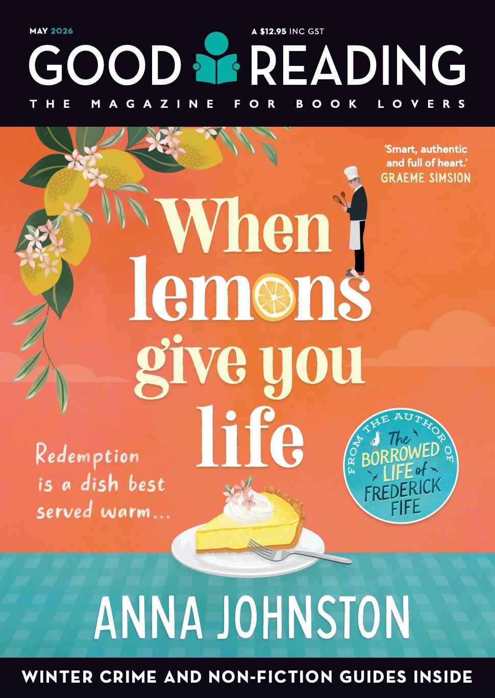
Modern romances tend to have very contemporary youthful designs with more simplistic covers.
There are lots of elements a designer can utilise on covers for romance novels and all its subgenres. Historical settings such as Victorian or regency. Images of war and resistance, depression and an array of dress uniforms to the flappers to minis and so forth.
Historical fiction seems to follow a theme. Often a young woman who is likely wearing red. Maybe it’s a red hat, coat, or dress, looking away, so mostly we can’t see her face. Is that intentional? I expect it is, so we create a picture of who she is in our own mind.
Scenes of historical city skylines, again with a woman in the foreground. This is particularly striking for stories set around World War II so spitfires are dotted around the sky.
Contemporary fiction feels like it might be a lot harder to design but could leave a much broader scope for covers to be just about anything a designer could dream up. Clean, uncluttered designs. Anything from abstract geometric shapes to striking images or even symbols. Type seems to play an even bigger role in this genre. Minimalistic plain white covers with tiny type in a corner. Or type that fills the whole cover. Fonts of all types and sizes appear all over the place. Go big, go small, but be bold. Often there’s a small palette of colours, two or three.
But sometimes I look at bookshelves and I see one colour, two, five, 10! There are no rules for this genre. The plan is to stand out from the crowd no matter what. Different is what’s required to catch your eye.
What about covers that have foil letters? Do they stand out from the crowd for you?
I have to say that I do like a book with raised letters. If a publisher combines the feel of a soft cover, silky to touch, with raised letters I am drawn to it. I seem to have an emotional response that makes me feel that whatever is inside the covers I will find intriguing. I can stand there, running my hands over it and feel good about it.
On the other hand, books with cut-outs so you can see through to a second cover underneath – these do not float my boat. I find them intensely annoying. They tear easily and spoil the look of the book. And it just simply feels gimmicky to me and that what’s inside won’t be the quality I’m after.
And of course there are kids books which are a whole other conversation that I can’t fit here! •
0 Comments